
Hertzsprung–Russell diagram
Images

Image Hertzsprung-Russell Diagram II


Key Facts
Meet the Star Map!
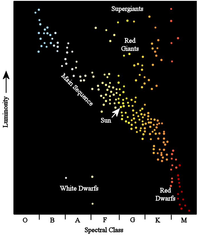
Imagine a giant chart that’s like a secret code for stars! It’s called the Hertzsprung–Russell diagram. Scientists use it to sort stars based on how hot they are and how bright they shine. Some stars are super hot and blue, while others are cooler and red. Some are tiny, and some are HUGE, like a million Earths put together! This map helps us understand our amazing universe.
Who Drew This Star Map?
Two clever scientists, Ejnar Hertzsprung and Henry Norris Russell, came up with this idea around the same time, over 100 years ago! They looked at lots of stars and noticed patterns. They realized that stars weren't just randomly scattered; they fit into groups.
It was like finding out that all dogs are different but still dogs! This discovery was a big step in learning how stars are born, live, and change over time.
Why This Map is Super Cool!
This star map is like a detective tool for astronomers. By looking at where a star is on the diagram, scientists can guess its age and what it will do next. Will it stay a star for a long, long time, or is it getting ready to change into something new? It helps us understand how stars live their lives, kind of like how we learn about animals. It’s a key to unlocking the mysteries of space!
How the Star Map Works
The star map has two main jobs. One side shows how hot a star is, from really hot blue stars to cooler red stars. The other side shows how bright the star really is, not just how bright it looks from Earth. Stars that are very bright and very hot are usually at the top. Stars that are dim and cool are usually at the bottom. It’s a simple way to see all the different kinds of stars out there!
Based on content from Wikipedia · Licensed under CC BY-SA 4.0