
Equal Earth projection
Images

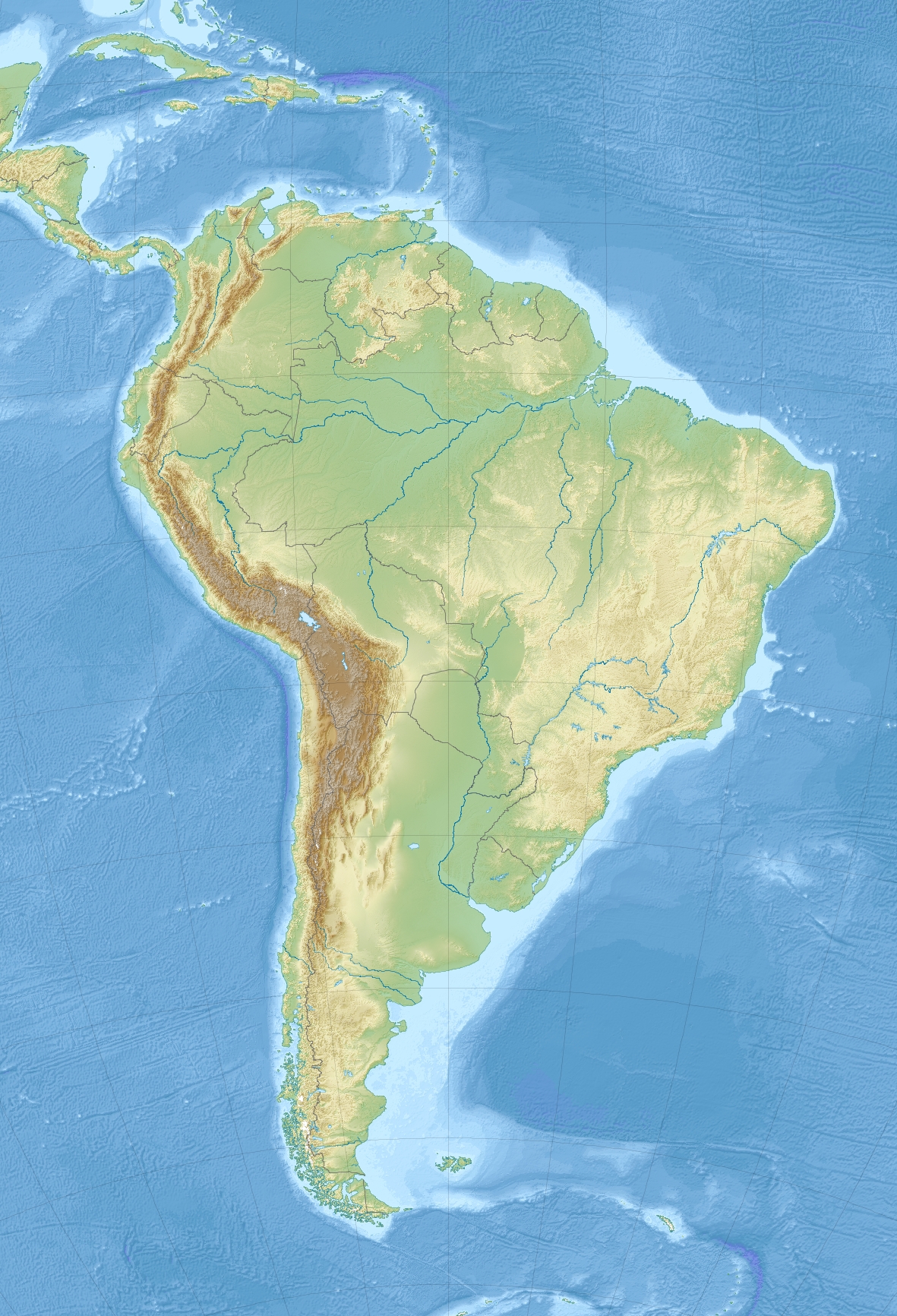
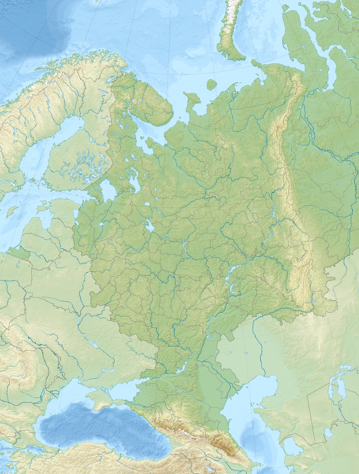
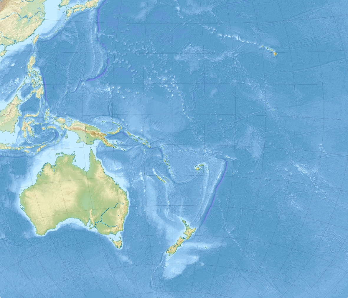
Blank world map with rivers Equal Earth projection


Key Facts
Meet the Map That's Fair to Everyone!
Have you ever seen a map where Greenland looks bigger than Africa? That's not quite right! The Equal Earth projection is like a super-fair mapmaker. It makes sure that the real size of countries is shown correctly. So, if Africa is super big in real life, it looks super big on this map too! It's like looking at your toys and knowing which one is truly the biggest, not just the one closest to you.
How Does This Magic Map Work?
This special map uses clever math to show our round Earth on a flat piece of paper. It makes the sides of the map curve a little, like a gentle hug for our planet. The lines that go up and down (meridians) are spaced out evenly, and the lines that go side to side (parallels) are straight.
This helps us see how far north or south places are from the middle of the Earth, called the equator. It's like drawing a grid on a ball to keep things tidy!
Why This Map is a Super Star!
This map is super important because it helps us understand the world better. When maps show countries their true size, we can learn about how big places really are. This is especially helpful for countries near the middle of the Earth, which are often shown as tiny on other maps.
The Equal Earth projection makes sure they get their fair share of space on the map, just like they do in real life. It's like giving everyone a fair turn on the playground!
A Map Made by Smarty Pants!
Three clever people named Bojan Šavrič, Bernhard Jenny, and Tom Patterson invented the Equal Earth projection in 2018. They wanted to make a map that looked good and was also accurate about country sizes. They looked at other maps and thought, 'We can do better!' So, they used some cool math ideas to create this new map that shows the Earth in a way that's both beautiful and truthful.
It’s like building the coolest LEGO castle ever!
Based on content from Wikipedia · Licensed under CC BY-SA 4.0